Inspirational journeys
Follow the stories of academics and their research expeditions
Data Visualization - Top Benefits and Tools

Introduction
Data Visualization: Introduction, Emergence, Tools, and Benefits
Representation of big data in a pictorial or graphical format with an attempt to help readers understand the information better is termed data visualization.
This modern form of visual communication enhances the chances of readers perceiving important data quickly and effectively. It focuses on the fact that details like statistics, trends, and correlations are often overlooked by the readers.
However, such information holds great potential and brings benefits when analyzed carefully. With it, the display of information becomes easy and less complicated; focusing majorly on vital information.
Table of Contents
Data Visualization Tools and Techniques
Coming to the usage and application, we bring you a quick list of the most popular tools and techniques in data,
Data Visualization Tools
Tableau
Aiming for individual use and a better understanding of data, Tableau is certainly the most popular data visualization tool used worldwide. It is used to create visualizations using dashboards and workbooks.
Tableau focuses primarily on helping the user understand the presented data easily. This business intelligence data tool is a must-have.
Data Wrapper
Popular in media organizations, Data Wrapper is one of the simplest, easy-to-use data tools. It is used to create basic interactive charts by uploading CSV data. Within minutes, the charts encompassing uploaded information are ready for use. The layout is clear and concise which helps a reader understand the data easily.

Fusion Charts
Fusion charts are a go-to tool for developers. It allows individuals to simplify complex data in order to make the most out of it. It offers JavaScript charts of about 95+ varieties and about 1500 maps for web and mobile apps.
Plotly
Plotly is one of the most user-friendly data tools. It allows APIs such as Salesforce and contains open-source visualization libraries of Matlab, R, JavaScript, and Python. It is a versatile data tool that offers statistical tools and options like online graphing for a better visual experience.
Benefits of Data Visualization Tools
To understand how beneficial data visualization tools are, one needs to first understand the extent, severity, and complexity of issues that rose due to big data.
With every passing moment, data is being generated at a rapid pace. Storing this data is complex yet essential.
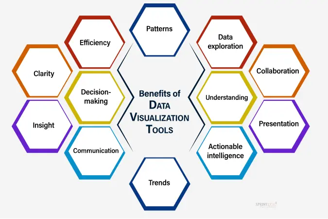
The insights and conclusions derived from these huge chunks of data sets are invaluable to several businesses. Hence, it plays a pivotal role in analyzing this data and helping the reader understand it better.
Listed below are the top benefits,
• Quick Access to Crucial Business Insights
• A better understanding of the relationship between performance and operations
• Faster to process when compared to text form of data
• Avoids missing out on information data
• Helps in identifying patterns and trends
• Accurate Customer Behavior Analysis
• Steady growth in business can be maintained by using the tools and keeping track of the data available
• A better comprehension of data
• Can use data to depict a story effectively
• Helps the audience perceive the information faster and better
• A great asset for visual learners
• Customized Data-Visualization
• Increases in productivity and sales

Conclusion
With the involvement of machine learning and artificial intelligence, data visualization is entering a new era. As it helps process and perceives data easily, it is widely adopted by all kinds of businesses.
In order to grow, having a stronghold of the market is important. With data visualization, businesses are well-equipped to keep track of the current market, and customer behavior and derive conclusions from the past data.
Handling big data is one thing and making the most of the information derived from it is the other. As a result, data visualization and its tools are not going out of focus anytime soon as they seem to have a promising future.
If you are aspiring to make a career in data handling, getting the Big Data Certification is a great option to gain knowledge and skills in the field. It is an industry-recognized certification with huge demand in the market. Other popular one is Big Data Hadoop and spark developer certification.
To explore more career-making courses, you can visit the Sprintzeal - All Courses, and for any course-related queries, you can chat with the course experts and find the training/certification that will benefit your career. Subscribe to our newsletters for latest insights and trends.
Categories
- Project Management 176
- Others 139
- IT Security 121
- AI and Machine Learning 111
- Digital Marketing 105
- Business Management 103
Recent posts
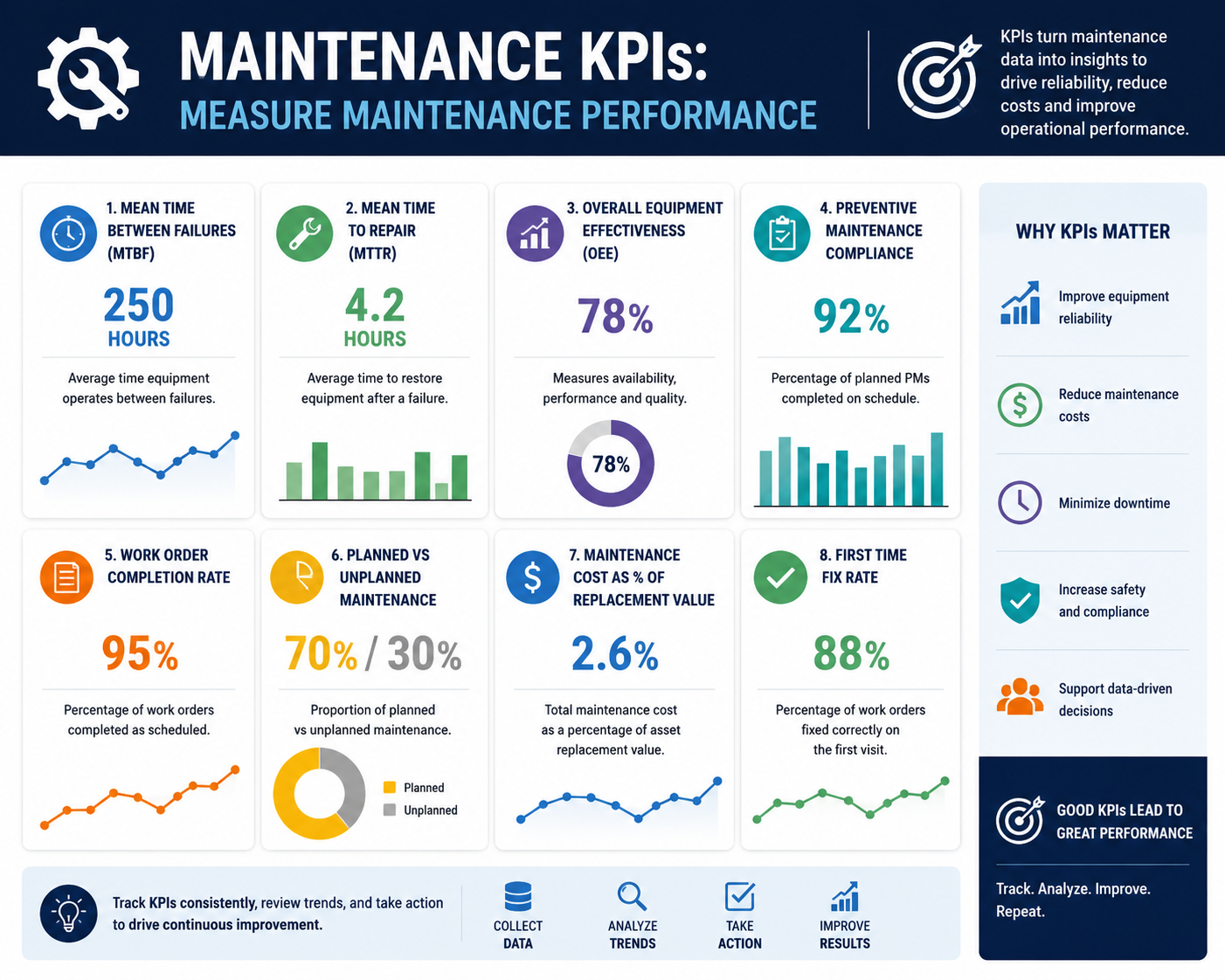
What Maintenance KPIs Do Managers Use for Smarter Resource Allocation?
Tue, 07 July 2026